


Redesigning Performance Analytics: A Collaborative Design Sprint for Airship's CRM Platform
AIRSHIP is a customer engagement platform that empowers businesses to deliver personalized, real-time messaging across multiple channels, including mobile apps, websites, and email. It helps optimize user experiences and drive business growth through data-driven insights and automation.
PERFORMANCE ANALYTICS is Airship’s data reporting tool that provides actionable insights into user behavior and campaign performance, enabling businesses to track, measure, and optimize their engagement strategies effectively.
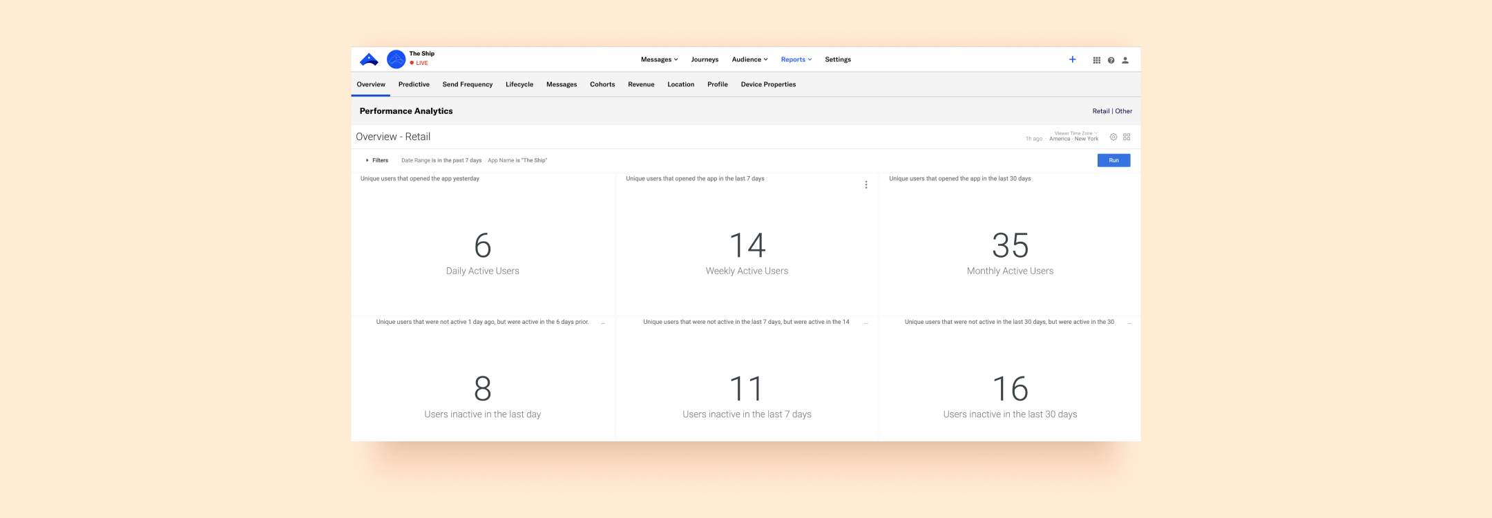
Performance Analytics interface, prior to the redesign.
CHALLENGES
The Performance Analytics (PA) product faced several challenges that impacted usability and customer satisfaction:
• Navigation Issues: Users struggled to navigate the product independently, often relying on external help.
• Customization Challenges: Creating and customizing dashboards was cumbersome and unintuitive.
• Complex Language: The interface language was difficult for users to comprehend, creating barriers to effective usage.
• Over-Reliance On Account Managers: Account managers reported that clients heavily depended on them to set up and manage PA, limiting clients' ability to use the product autonomously.
• Outdated Design: The product had not been updated in 9 years, making a redesign essential to remain competitive and meet modern user expectations.
OBJECTIVE
The goal was to streamline the user experience, making PA more intuitive and user-friendly while ensuring it remained competitive and effectively addressed user needs. With diverse stakeholders—including engineers, data scientists, designers, and the product manager—the challenge was to foster effective collaboration and align priorities to achieve the best possible outcome.
DESIGN SPRINT
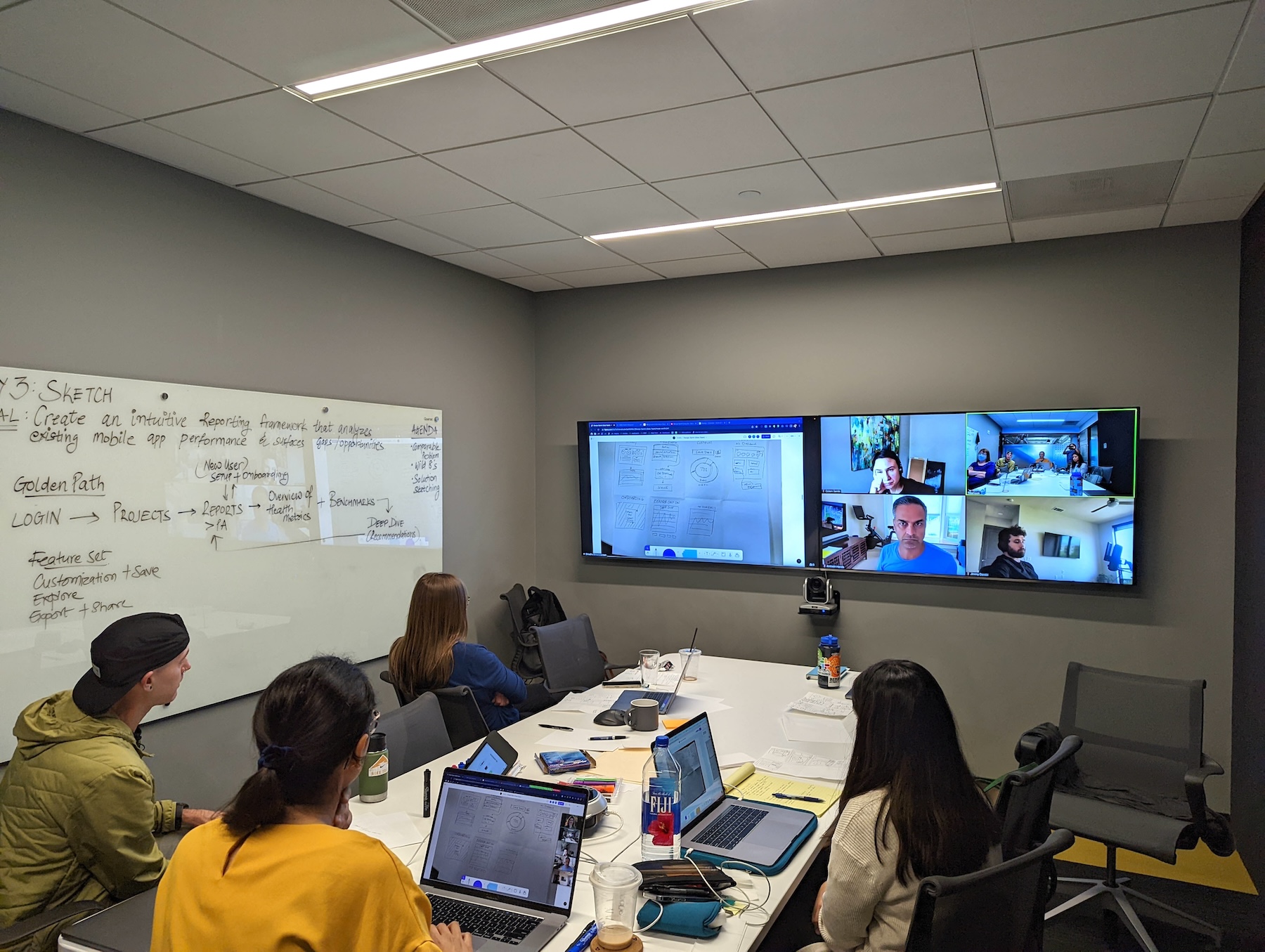
Armed with comprehensive user research, I facilitated a design sprint, bringing together all collaborators. The sprint provided a fast and practical framework to tackle the project effectively.
The sprint brought together 8 participants, both in-person and remote, including the VP of Design, Director of Design, two Product Designers, the Product Manager, a Staff Engineer, and two Data Scientists.
In the weeks leading up to the sprint, a fellow Product Designer and I worked to prepare and address potential challenges:
• Fostering Team Cohesion: Breaking the ice among a diverse group of professionals from varying backgrounds.
• Bridging Knowledge Gaps: Ensuring all members, regardless of familiarity with the sprint process or the product, were aligned on key concepts and research.
• Facilitating Hybrid Collaboration: Creating an environment where both in-person and virtual participants could collaborate effectively and ensuring every voice was heard.
• Adapting to Virtual Needs: Maintaining a pace and structure that accommodated the unique requirements of remote team members.
• Sprint Asset Design: Developing all necessary materials, including presentations, FigJam boards, and on-site resources, to support a smooth and productive sprint.
SPRINT STRUCTURE

Day 1: UNDERSTAND
• Kickoff & Icebreaking: Introductions and team-building activities to establish rapport among participants.
• Stakeholder Alignment: Insights were shared by stakeholders, including two Technical Account Managers who delivered lightning talks to provide valuable perspectives. Sprint goals and objectives were defined.
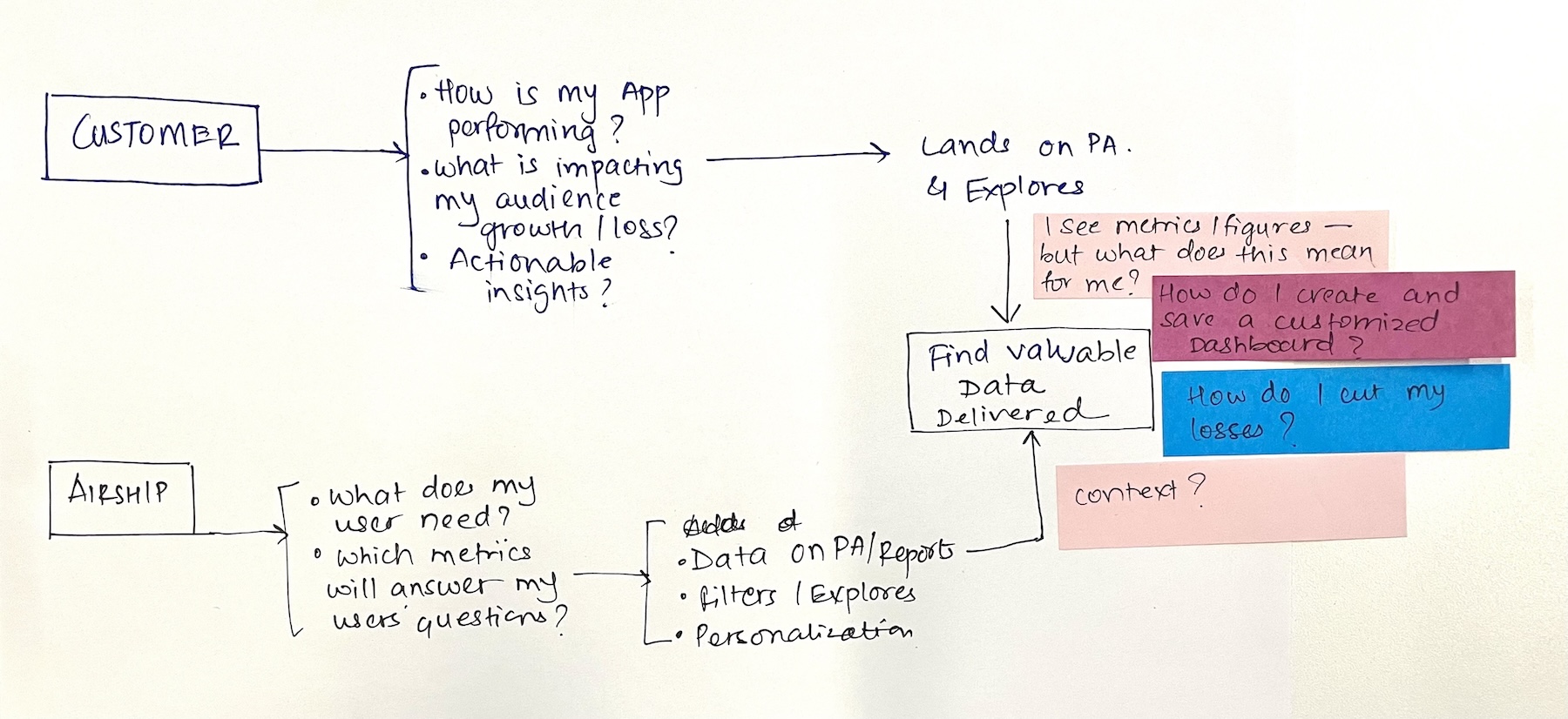
• Scope Framing: Potential and desired outcomes of the sprint were brainstormed, ensuring alignment with user needs. This led to a clearly defined goal: Create an intuitive reporting framework that analyzes existing mobile app performance and surfaces gaps/opportunities.
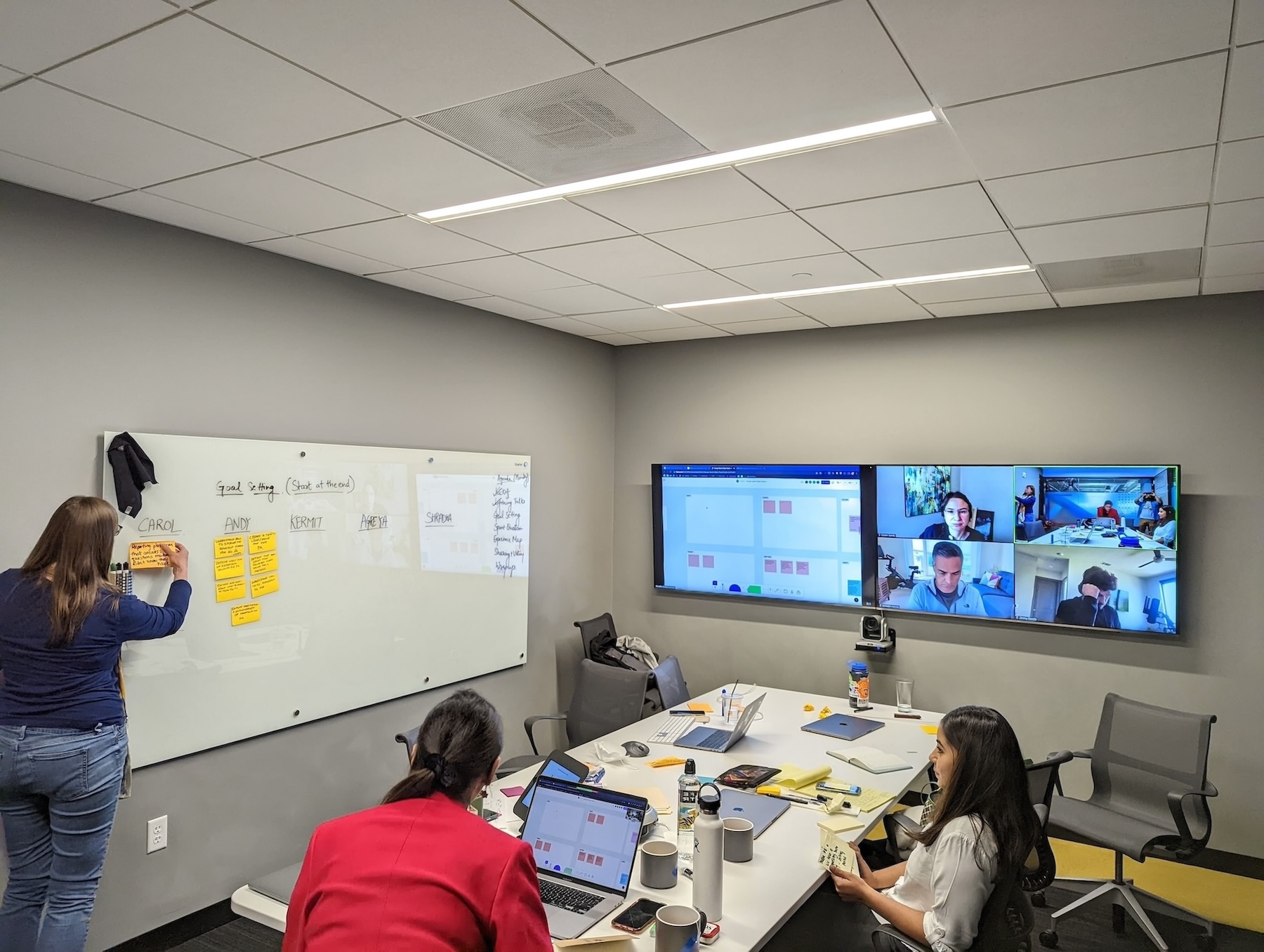
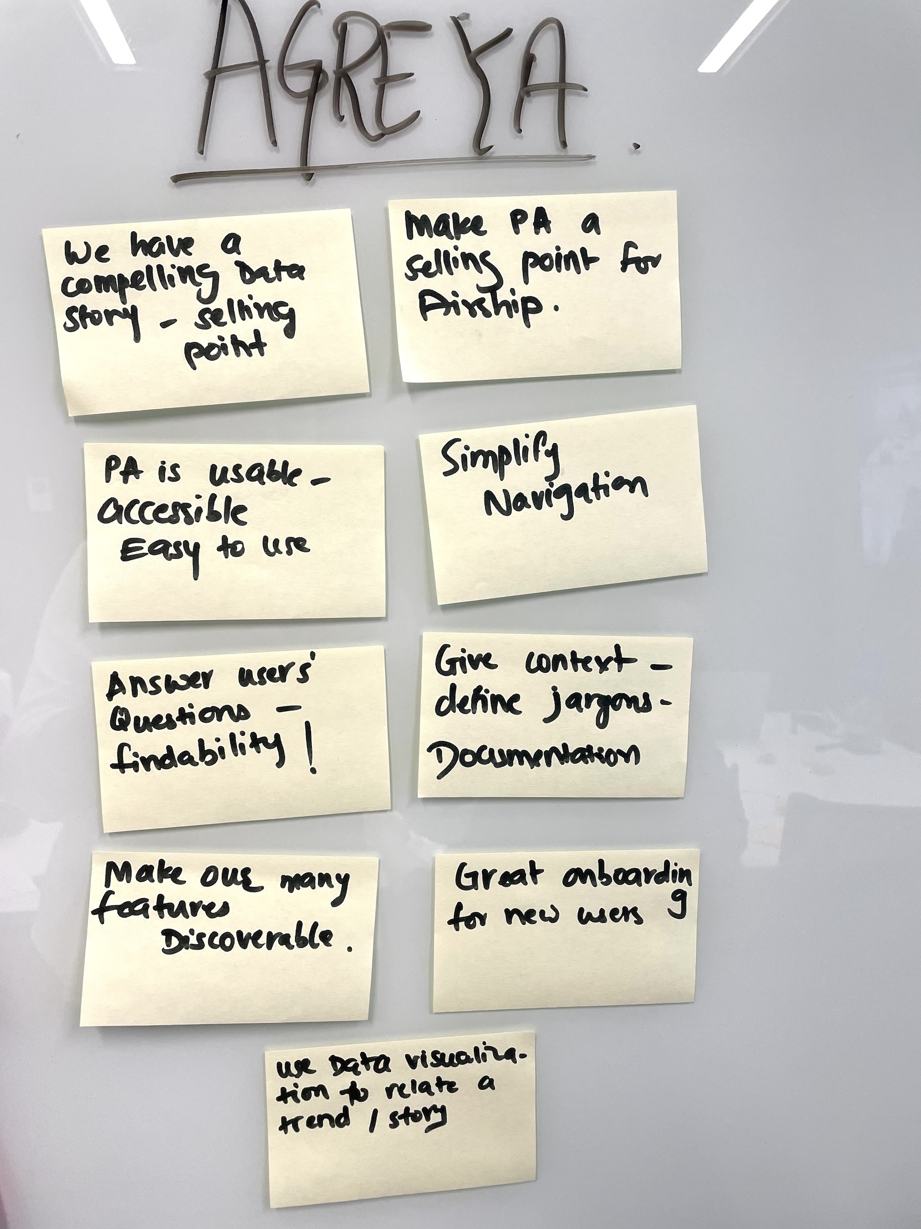
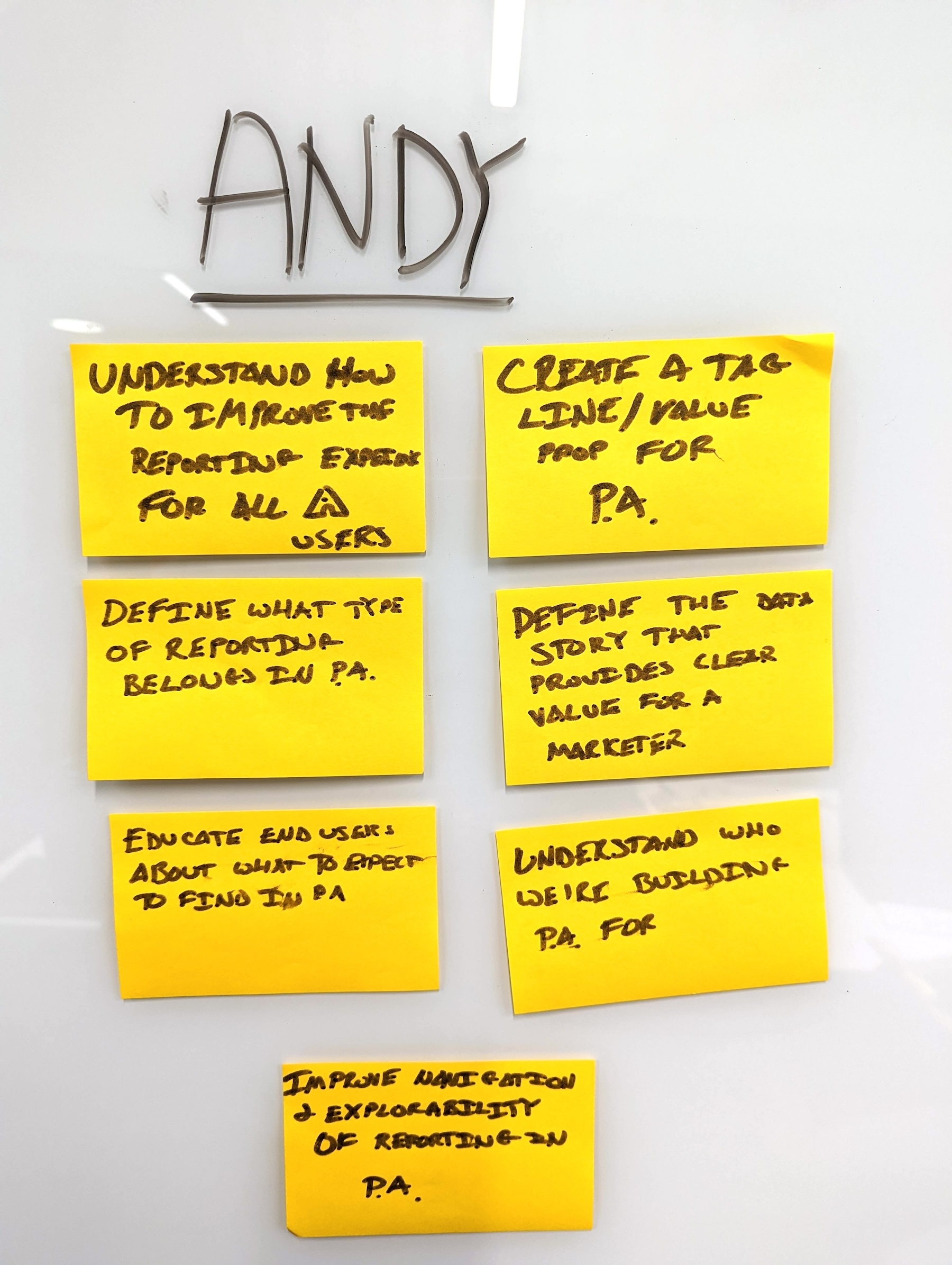
Participants map the scope of the sprint on the first day.
Day 2: DEFINE
• The Golden Path: Participants generated ideas individually, then refined them collaboratively to identify the "golden path" for the solution.
• Key Feature Set: The team identified the core features deserving focus during the redesign: 1. Customization+Save, 2. Explore, 3. Export+Share.
• How Might We: Participants framed "how might we" questions, which were dot-voted on to prioritize design challenges.

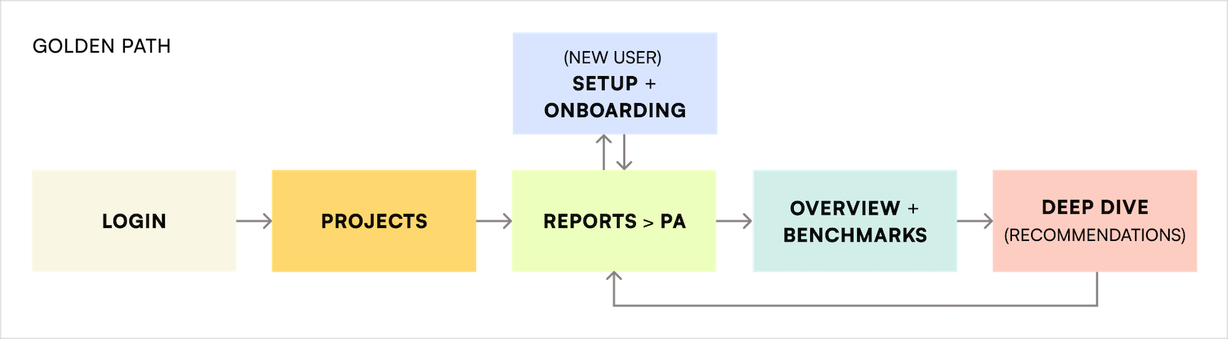
Team discusses “how might we” questions on the second day of the sprint; exploration for the golden path; the golden path.
Day 3: SKETCH
• Competitive Analysis: Participants conducted a competitive analysis, gathering data on market competitors, and presented their findings to the team.
• Wild 8s: Each participant sketched 8 ideas for the ideal solution, which were presented and refined through dot voting.
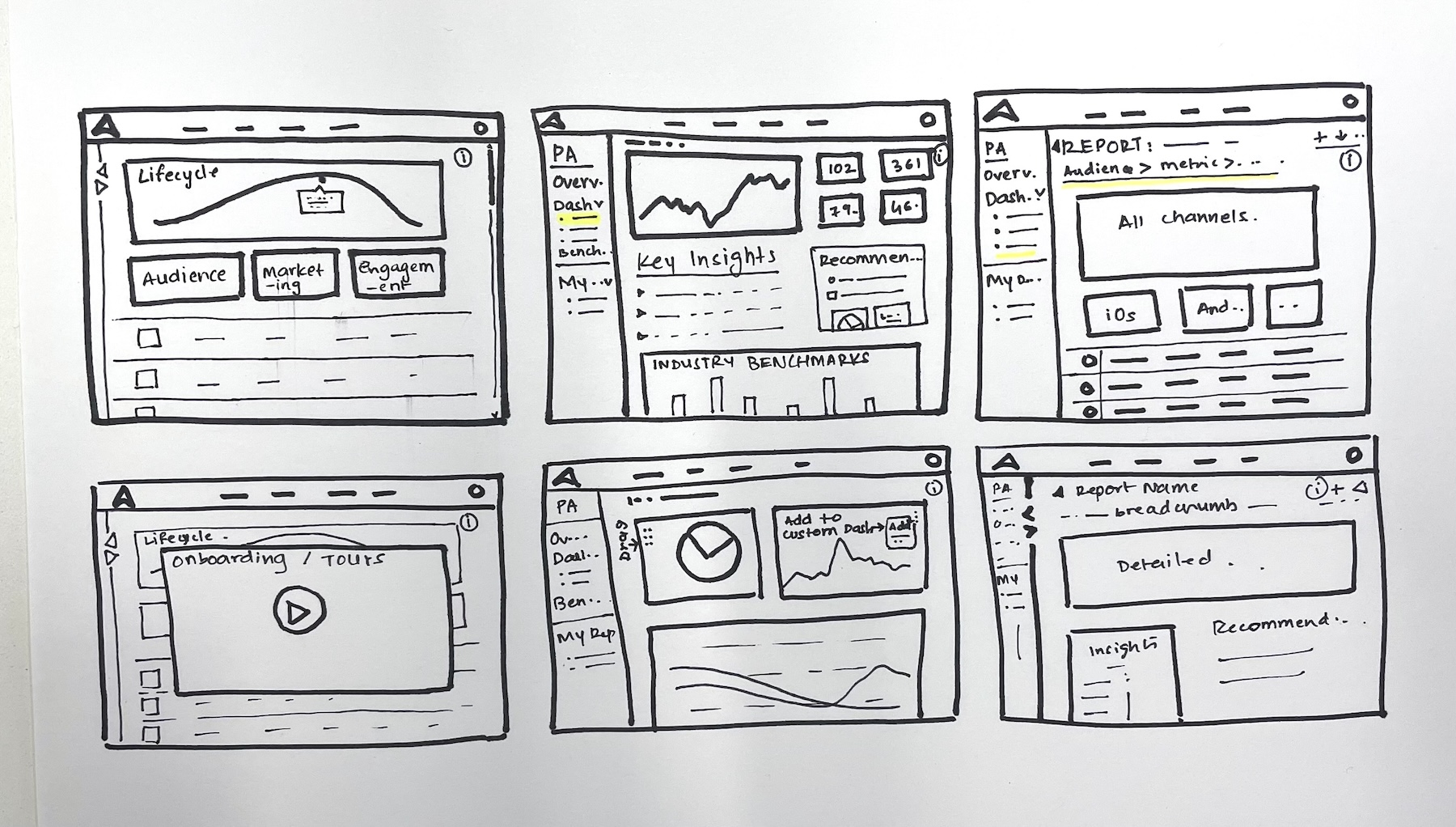

The team reviews Wild 8 sketches by the participants on the third day of the sprint.
Day 4: DECIDE
• Data Funnel Exploration: Participants individually proposed stratified data funnel structures to optimize how reports would be represented in Performance Analytics. Dot voting helped refine the best ideas.
• Decision Making: The final prototype direction and data funnel format were selected for development.
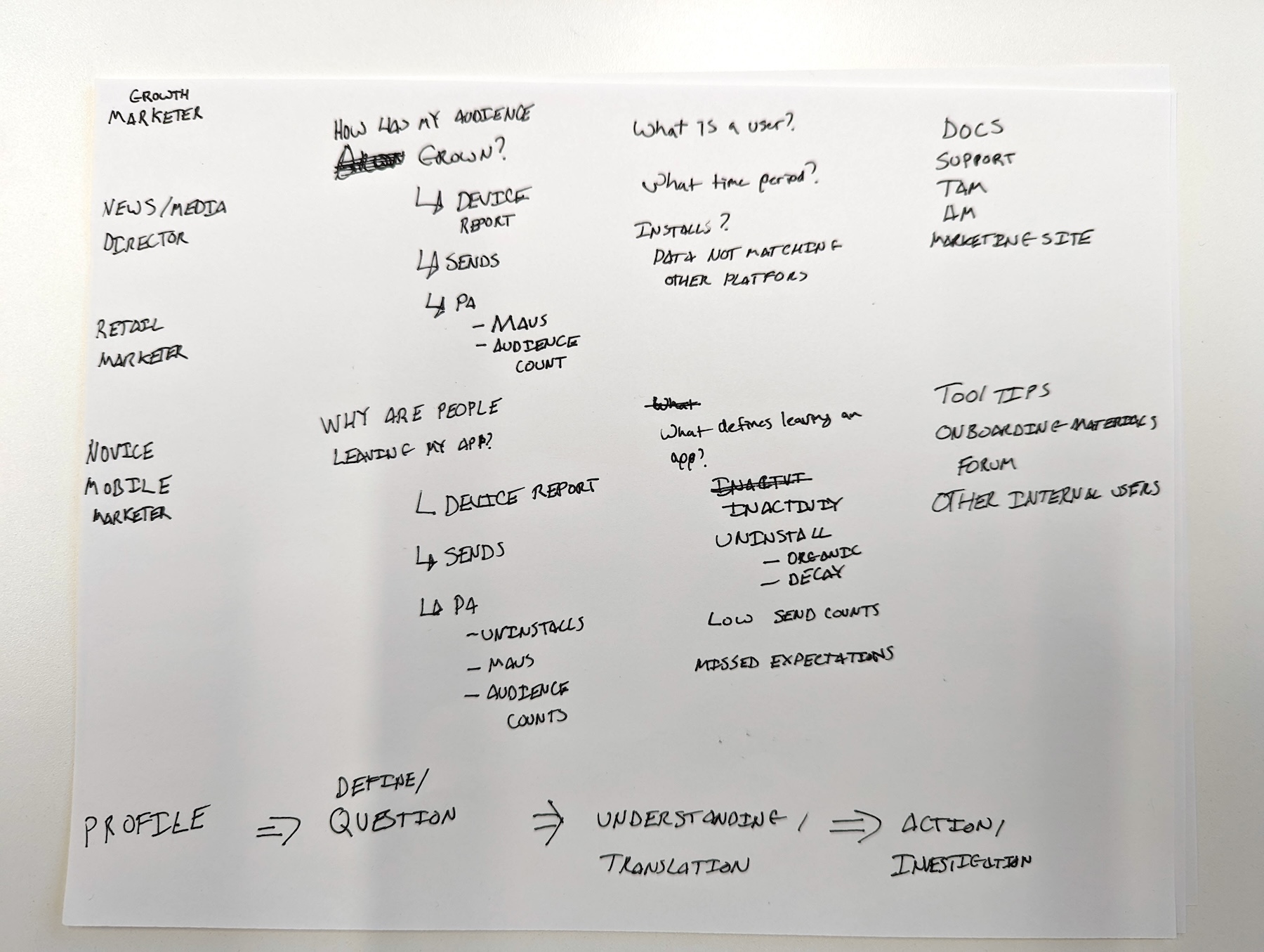
Tracking data through the lens of diverse personas; exploration for the final data funnel.
Post Sprint: PROTOTYPE, TEST, ITERATE
A prototype was developed following the sprint based on the selected design direction. It was tested directly with users, gathering feedback to validate and refine the design.
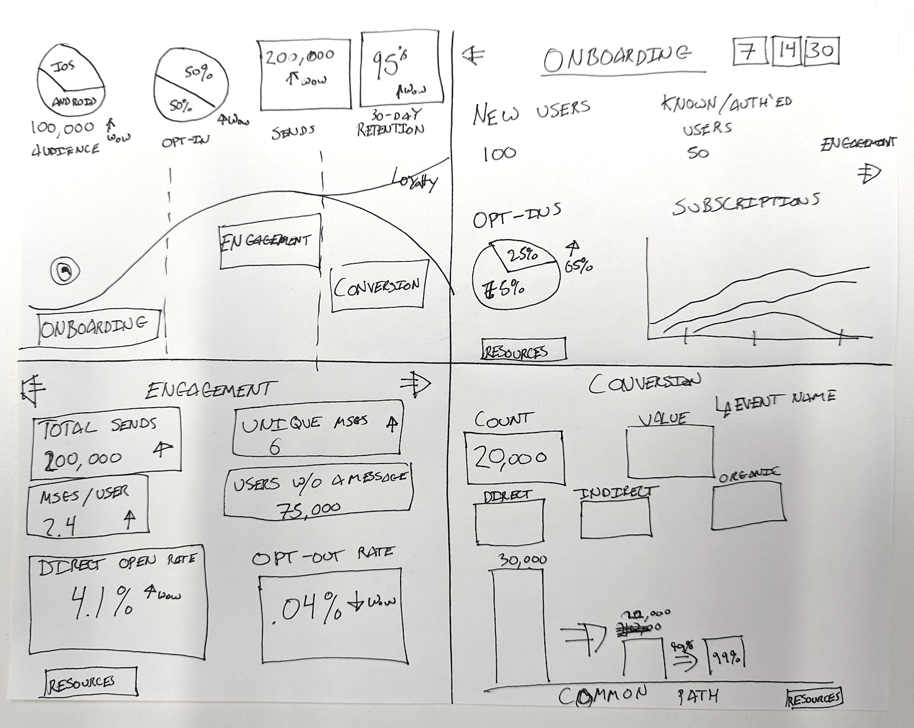
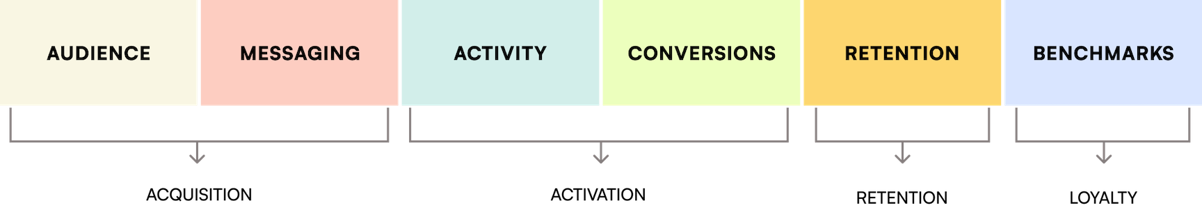
The data funnel was then translated into the following Performance Analytics dashboards:
RESULTS
DESIGN UPDATES
Key design updates to enhance usability and user experience:
• Navigation: Restructured navigation by splitting it into a horizontal bar and a side panel for improved clarity and ease of access.
• Search: Introduced a dedicated search function to help users quickly locate specific data and reports.
• Filtering: Relocated filters from a collapsible panel to a fixed position next to the search bar, streamlining access and usability.
• Data Visualization: Improved data graphics for better readability, incorporating trend indicators alongside figures to provide actionable insights.
• Save: Introduced the ability for users to save preferred reports directly to their dashboards for quick future access.
• Verbiage: Refined report titles and descriptions to align with industry standards and better fit users’ mental models.
• Style: Redesigned color and font choices to enhance hierarchy, improve visual language, and align with the product’s updated design system.
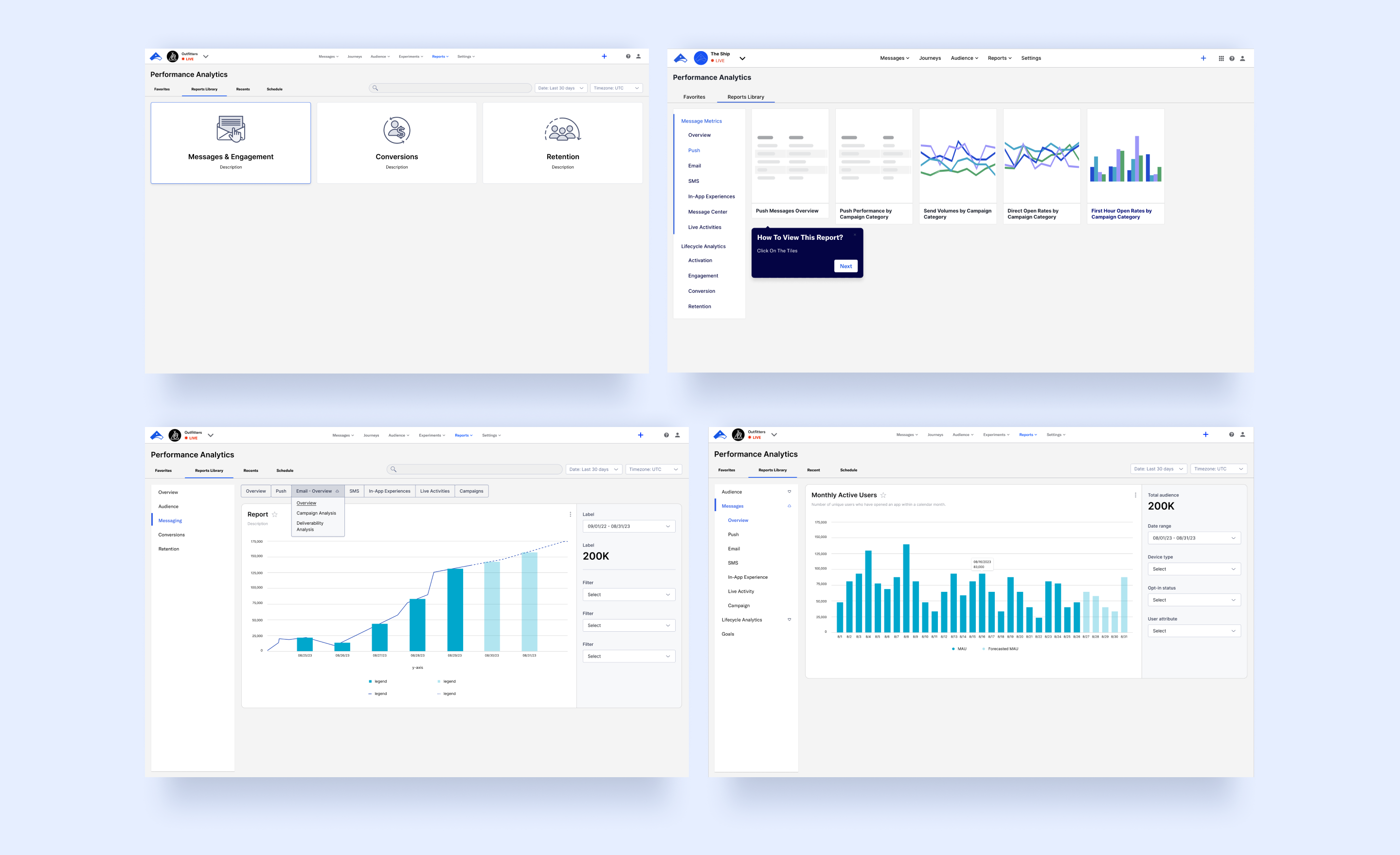
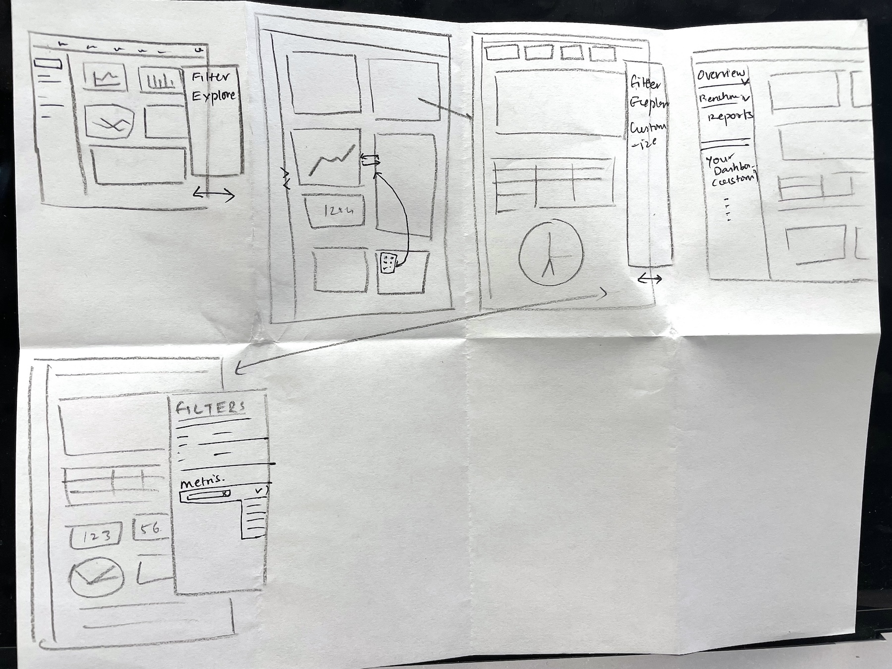
Explorations and archived iterations from the Performance Analytics redesign, showcasing various approaches to navigation restructuring, filtering enhancements, and user onboarding.
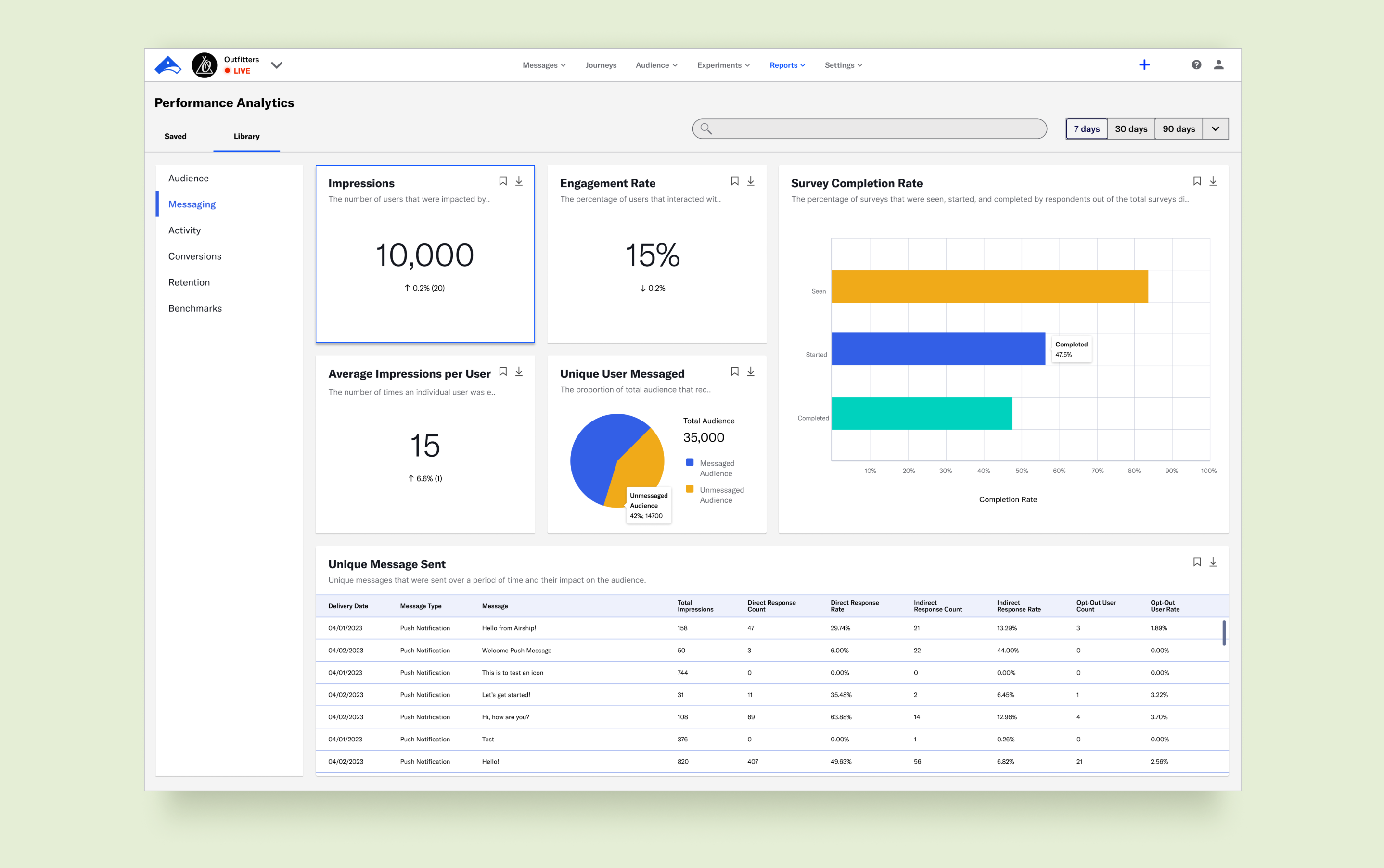
Performance Analytics redesign - Messaging dashboard. Gradual iterations led to enhanced data visualization and a streamlined information architecture for a more intuitive user experience.
USER REVIEWS
Testing the revised Performance Analytics with clients and internal teams yielded positive feedback:
• Ease of Use: Users reported significantly higher satisfaction with the intuitive design and streamlined navigation.
• Efficiency: The redesigned features improved users' ability to complete tasks independently and effortlessly.
• Advocacy: Users expressed a greater likelihood of recommending the product to others, reflecting increased confidence and satisfaction with the tool.
FUTURE CONSIDERATIONS
The next phase for Performance Analytics focuses on elevating its technical capabilities with the following enhancements:
• Customizable Dashboards: Empowering users to tailor dashboards with adjustable layouts, personalized widgets, and saved custom views.
• Predictive Analytics: Integrating advanced analytics to forecast trends, identify risks, and uncover opportunities, providing actionable insights.
• Performance Snapshot: Introducing a concise overview of performance health displayed upon landing, offering users immediate, high-level insights at a glance.

© 2024 Agreya Gandhi


